Indigo rebrands its iconic plum+ program
Work

Indigo’s plum and plum+ are icons of the Canadian rewards program landscape. As a program belonging to Canada’s leading book and lifestyle retailer, it was time to give its visual identity a bit of a refresh.
A reader is always ready for the sequel. They never stop searching. Every story is a new world to dive into—a chance to discover something new, not just about the characters in the book, but about themselves. And plum+ amplifies those opportunities. It expands the reader’s exploration and rewards them for it. It gives them a chance to get to know themselves in a new way, to plus up their plotline on their terms. With plum+ they get what they love plus even more, including perks like 10% off almost everything and free shipping with no minimum spend.
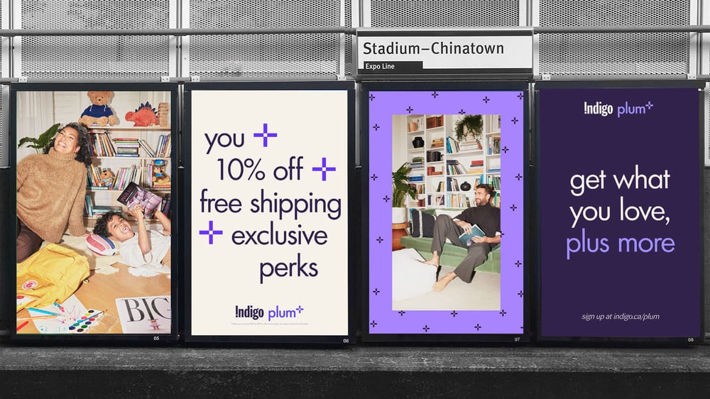
In partnership with Cossette, Indigo has brought this rebrand to life using a combination of organic and paid social, digital and static OOH, and owned channels. The new plum+ logo, colour palette and overall design system work to inspire without sacrificing relatability. The plum+ symbol was created to represent individuals of all backgrounds and interests coming together to gain knowledge, spark inspiration, master skills, and indulge in hobbies. The colour palette was refreshed with richer tones of plum and purple, while the new design is energizing and contemporary, yet approachable.