The Montreal Roses: Women’s soccer shows its thorns
Work
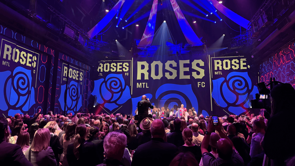
Montreal’s professional women’s soccer team is finally ready to reveal its name: the Montreal Roses. It’s more than a team—it represents a desire to do things differently. The branding, like the team itself, breaks away from the category’s traditional tropes, showing that it’s passionate, inclusive, authentic, and Montreal to the core.
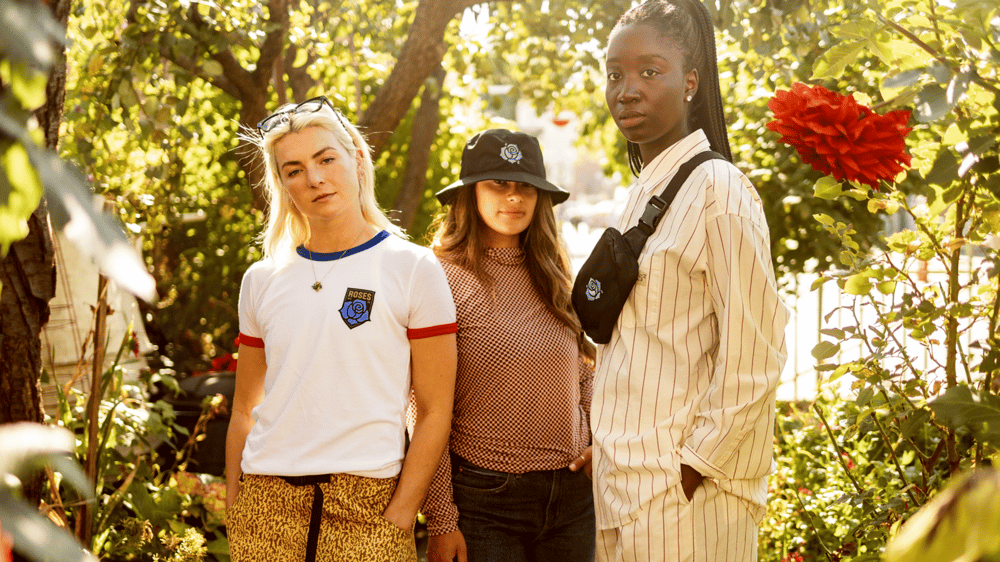
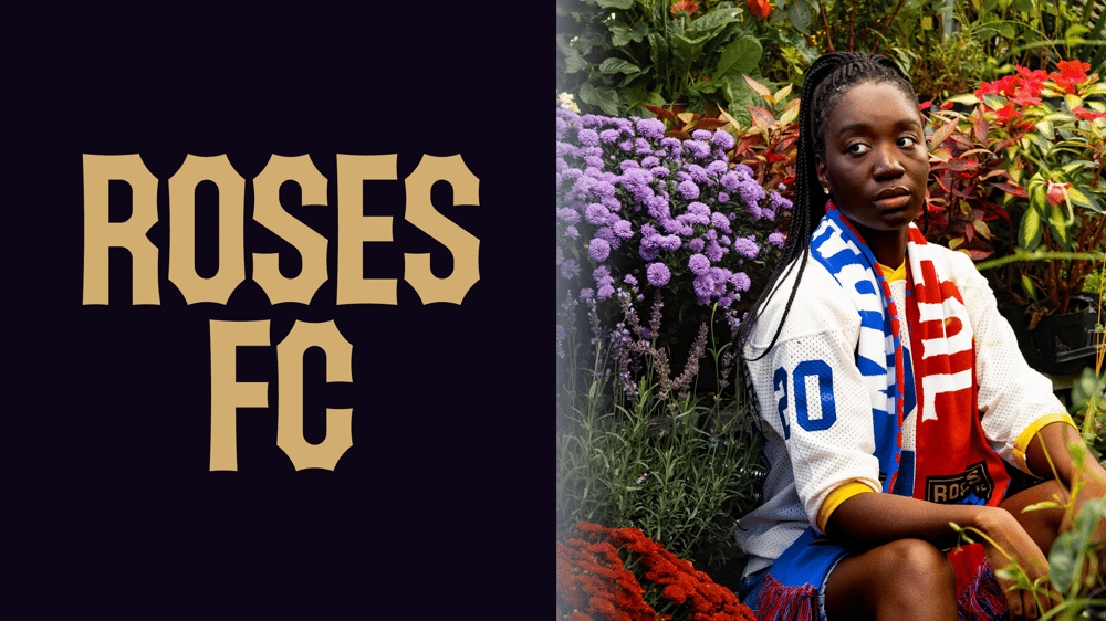
Ahead of the Northern Super League’s official season opener in April 2025, the club called on our team and GRDN to develop a brand that lives up to its ambitions. The two agencies collaborated to develop an overall view of the brand and its mission, vision, values, strategic positioning, name, and visual identity, as well as establish a launch strategy. We also built its website, which includes an e-commerce platform where fans can purchase items from the team’s very first branded collection of clothing and accessories.
From the outset, the club was created with one goal in mind—establish itself as a new model for innovation in Canadian soccer and reduce gender inequality in the sport through a brand with a bold purpose and character. To build an inclusive and inspiring movement for both young people and the community at large, the team consulted a number of individuals from all spheres, not just diehard soccer fans. With this enlightened global perspective, the team aims to offer women and girls the opportunity to dream and strive for a career in the world of sports.
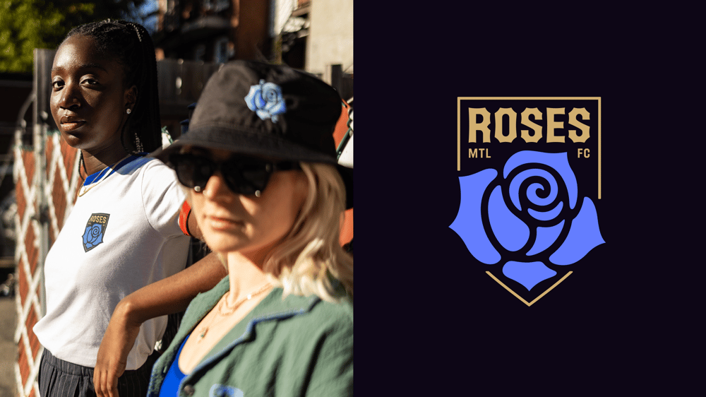
A distinctly memorable brand in the sports landscape
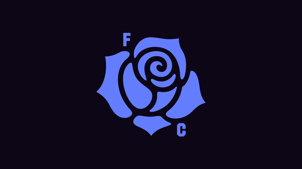
The name “Roses” is inspired by several powerful elements, including the city of Montreal’s floral logo. The somewhat mythical blue rose is a symbol for making the impossible possible and embodies power, passion and progress. It stands for the city’s creative spirit and its diversity of cultures. The shield conveys a warrior’s spirit and the ability to remain steadfast and strong on the field.
The abbreviation “MTL” brings a touch of modernity and local pop culture to the emblem, while the label “FC” is internationally renowned and anchors the team in the worldwide soccer community. Together, these elements reflect the energy that undeniably emanates from the city and its communities, drawing inspiration from its heritage to pave a new road to the future.
Colours anchored in Montreal culture
The red and the blue illustrate the diverse cultural heritage found in both the city and the province. They’re deeply rooted in the history of local sports teams, thereby creating a strong sense of belonging. Their unique and vibrant hues remind us of Montreal’s liveliness, culture and passion for sports, evoking both the warmth of its people and the toughness of its winters.
The typography is reminiscent of a rose’s thorny stem and the letters from the iconic Farine Five Roses sign in Montreal. This assertive font gives power and presence to the club and its voice.

To bring this vision to life, entrepreneurs and leaders from all walks of life were involved in the project. These include Sylvie Bovet, Mark Pathy, Coralie Beauchamp, Eddy Jr. Savoie, LCI Education, Malek Chamoun, Christiane Germain, Josée Perreault, Bruny Surin, Patrice Bernier, Caitlin Rose, Julie du Page, Isabelle Éthier, and Maxime Crépeau.